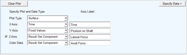
How to Create 4D Plots
The sections below describe how to create 4D Plots of each type and employing each of the rendering options.
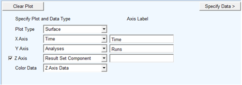
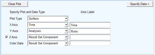
Result vs Time across Analyses
1. Start by selecting the Analyses option from either the X or Y axis option menu and optionally specify text for the labels of the X and Y axes.
2. Next click the "Specify Data" button.
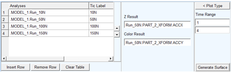
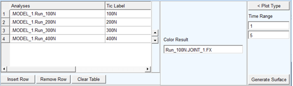
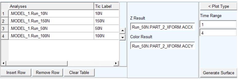
3. The next page, the Specify Data page, has a table to populate with the set of analyses to be used and it has fields in which to specify the result sets to be used for the values of the Z-axis and, if chosen on the Plot Type page, the surface color.
4. Select multiple analyses from the database navigator using the context menu via clicking the right-mouse button from within the first column of the data table.
5. In the second column one can specify the tic label to be used for each of the analyses. If left blank the short name of analyses will be used.
6. Then, in the "Z Result" field, select the result set component to be plotted from each analysis. It does not matter from which analysis you choose this result set component. This same result set component will be plotted from each of the analyses in the table.
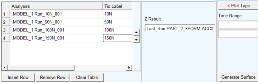
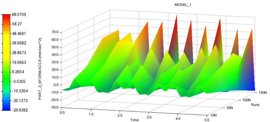
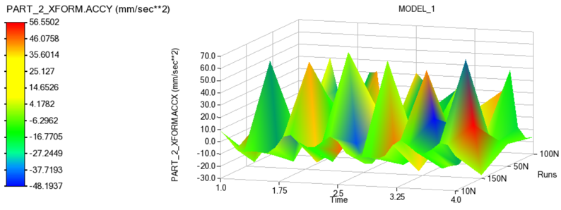
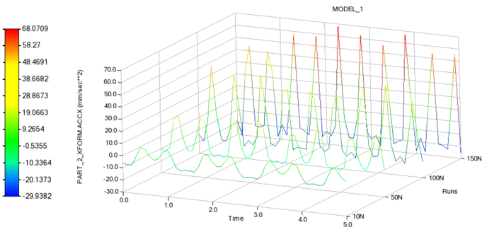
7. Finally, click "Generate Surface" and the Plot will be created:
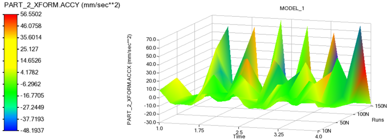
Independent Surface Color
In the above example, the color interpolation is done based on the Z result set component (that is, the "height" of the surface).
To plot color as separate component, set "Color Data" to "Result Set Component" as follows:
Then, the Specify Data page will present an additional field for "Color Result" field from which an result component can be selected.
Time range can be used to plot a data within values of interest.
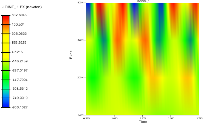
Then, if you click Generate Surface the surface color will be based upon the result set component in "Color Result." Also notice that the color legend gets an independent label.
Color Map
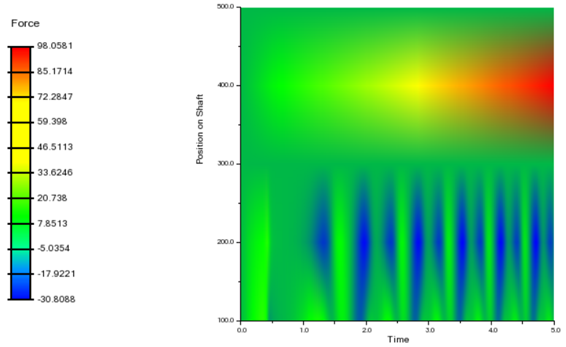
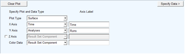
In the examples above, the data is rendered as a 3D surface. To plot the data as a 2D color map, a Z axis is not required. To achieve this, uncheck the "Z Axis" option and set Color Data to "Result Set Component" as follows:
Then, the Specify Data page will present only the "Color Result" field from which a result component can be selected.
Then, if you click Generate Surface, the 2D Color Map will be generated with color values based upon the result set component specified in the "Color Result" field with a corresponding legend.
Sequence of Analyses
With the arrow buttons provided in analyses data table, analyses can be re-arranged in upward and downward directions with up and down arrows.
For example, analysis for 150 N has been shifted upwards to the second position.
Now, "Generate Surface" will create the surface according to this sequence of analyses.
Using Stacked Curves
To plot the data in the form of stacked curves go to the Plot Type page and set Plot Type to "Stacked" as show below. Then, proceed through the Specify Data page to generate the plot.
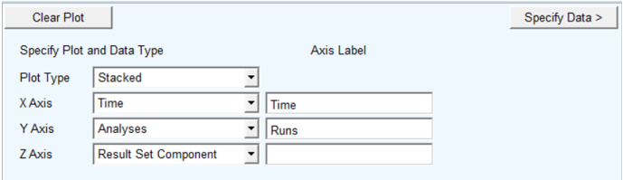
Note that when Stacked curves option is selected, color cannot be set independently. This is supported only for the "Surface" plot type option.
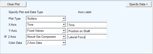
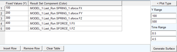
Result vs Time across Fixed Values
1. Start by selecting the Fixed Values option from either the X or Y axis option menu and optionally specify text for the labels of the X and Y axes.
For example, the Fixed values could represent physical locations at which the model is instrumented and, therefore, a result component is present in analysis for each.
2. Next click the "Specify Data" button.
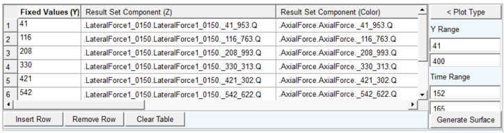
The next page, the Specify Data page, has a table to populate with the mapping of Fixed Values to Result Set Components.
3. Select multiple analyses from the database navigator using the context menu via clicking the right-mouse button from within the second column of the data table. Multiple components can be selected and it will result in as many rows as is required to accommodate all selected components. If components are already present in those cells then these will be replaced.
4. Time range and data range can be used to plot data within values of interest.
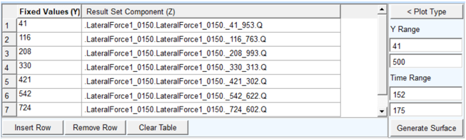
5. Finally, click Generate Surface to create the plot:
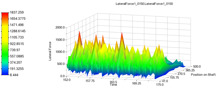
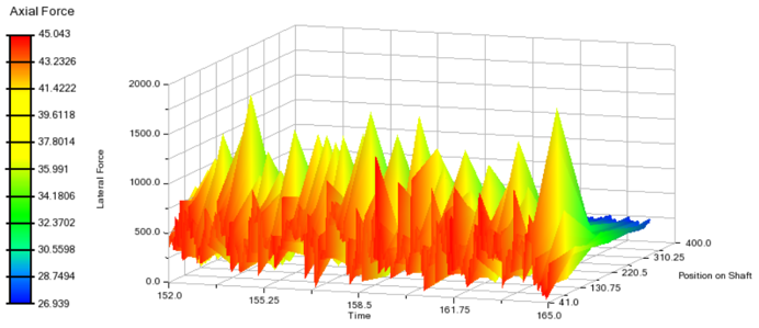
Independent Surface Color
In the above example, the color interpolation is done based on the Z result set component (that is, the "height" of the surface).
1. To plot color as separate component, set "Color Data" to "Result Set Component" as follows:
2. Once Color Data has been selected as "Result Set Component", the data table on the Specify Data page will have another column in which result set components for color can be chosen.
3. Then, if you click Generate Surface the surface color will be based upon the result set component in "Color Result." Also notice that the color legend gets an independent label.
Color Map
In the examples above, the data is rendered as a 3D surface. To plot the data as a 2D color map, a Z axis is not required. To achieve this, uncheck the "Z Axis" option and set Color Data to "Result Set Component" as follows:
The Specify Data page will have a column for color result set components only.
Then, if you click Generate Surface, the 2D Color Map will be generated with color values based upon the "Result Set Component (Color)" column.