Additional Topics
Setting Curve Properties
You can specify properties for curves as explained below. You can also set defaults for how Adams PostProcessor creates curves, as explained in PPT Preferences - Curves.
Note: | In addition to setting a curve's properties, you can edit the data in the curves. Learn about performing calculations on curves. |
To modify the properties of a curve:
1. Select a curve.
2. In the Property Editor, set the properties for the curve as explained in the table below.
Curve Property Options
To set: | Do the following: |
|---|---|
Text for legend | In the Legend text box, enter the text to appear in the legend associated with this curve. Adams PostProcessor displays the legend with a short line segment illustrating the color and line style of the curve. If you updated your plots, Adams PostProcessor creates a second legend, called the simulation legend. You modify the simulation legend text separately. For more information on modifying legends, see Modifying Legend Properties. For more information on the types of legends, see Updating Plot Data. Note: You may want to expand the width of the Property Editor so you have more space for entering the legend text. To expand the property editor, point to its right border. When the cursor changes to a double-sided arrow, drag the cursor to increase the property editor's size. |
Color | Set Color to the color for the curve. |
Line style and weight | Select the type of line style and weight for the curve. The weight values range from 1 to 5 screen pixels. You can also set the line style to None so that Adams PostProcessor does not display the curve line. If you selected to display symbols along the curves, the symbols still appear when you turn off the curve line. The effect is a scattered plot. |
Symbol and symbol increment | Select the type of symbol that you want at data points along the curve and select how often you would like the symbol to be displayed along the curve. |
Hotpoints | You can turn on hotpoints that let you manually edit the data points in the curve. You can also control how you edit the hotpoints, only vertically or only horizontally, so you have greater control. For more on hotpoints and manually editing curves, see Manually Changing Data Point Values. Select one of the following: ■Off - To have no hotpoints displayed. ■On - Turn on hotpoints, to allow the editing of the data points in any direction. ■Horizontal - Turn on hotpoints, but only allows the editing of the data points in the horizontal direction. ■Vertical - Turn on hotpoints, but only allows the editing of the data points in the vertical direction. |
 on the
 Modifying Legend Properties
You can change the placement and border of legends on your plots. There are two types of legends in Adams PostProcessor:
■Curve legend text that describes the data that each curve on the plot represents.
■If you update your plot data, as explained in Updating Plot Data, Adams PostProcessor creates a second legend, called the simulation legend. The simulation legend contains groups of text that describe the data in a specific simulation.
This procedure does not let you change the text of legends. Learn about changing curve legends.
You also cannot change the legend when a plot is displayed as a table. Learn about displaying plots as tables.
To modify legend properties:
1. Select a legend.
2. In the Property Editor, turn on the legend.
3. Set the properties for the legend as explained in the table below.
Plot Legend Property Options
To set: | Do the following: |
|---|---|
Transparency of the legend | If you want the legend to be transparent, clear the selection of Fill. Any plot information behind the legend shows through. When you select Fill, the legend is opaque and covers any information behind it. |
Placement of the legend | Set Placement to any of the following: ■Top Right ■Top Left ■Bottom Left ■Bottom Right ■Axis - Places the legend text for each legend on the appropriate dependent axis. |
Whether or not the legend has a border and the border's style | If you do not want a border around the legend, clear the selection of Border. If you do want a border, keep Border selected and then select a color, line weight, and line style for the border. |
Adding Notes and Modifying Text
You can add text, called a note, to any area of your plot and set the appearance of the note. For example, you might want to add a note that points out a trend in a plot or that labels a data point. Once you've created the note, you can modify it and change its placement by dragging it. You can also modify the text of titles and subtitles.
Learn about adding notes and modifying text:
Creating Notes
You can create notes with one or more lines of text.
To create notes on your plots:
1. From the Plot menu, select Create Note.
Tip: | From the Main toolbar, select  . . |
2. Click where you want the note to appear, and enter the text, pressing Enter to create another line of text.
Modifying Text
You can modify any existing notes, titles, and subtitles.
To modify existing text:
1. Select the text.
2. In the Property Editor, enter or change the text in the text area. You can enter multiple lines of text.
3. Set the options for the text as explained in the table below.
Label Options
To set: | Do the following: |
|---|---|
Size of the text | In the Font Size text box, enter a font size. The font size you can enter depends on the type of font you selected. |
Orientation of the text | Select either: ■Horizontal - text ■Vertical -  |
Alignment | Select how you want the label to be aligned relative to its anchor position, which is the center of the text. See the figure below. You can select: ■Left - Left-justifies the text from the anchor position. ■Center - Centered the text on its anchor position. ■Right - Right-justifies the text from the anchor position. 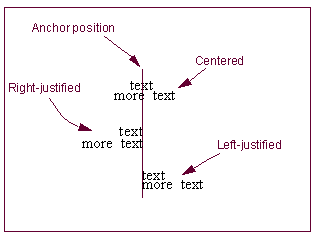 |
Color | Set Color to the color for the text. |
Location | Clear the selection of Auto Position and enter a location for the text. |
Moving Text
The following shows how to move the text of notes, titles, subtitles, and legends by dragging it. You can also position the text precisely using the Property Editor as explained in Modifying Text.
To move text by dragging it:
1. Select the text.
2. Drag the text in the direction you want to move it.
Adding Spec Lines
2D Plot
You can add spec lines to your plots to help you compare curves to a constant baseline value. A spec line can be a horizontal, vertical, or diagonal line that indicates a value of significance. You can start the spec line at any X or Y position.
For example, if you are plotting acceleration and you want to keep the acceleration below a certain value, you can add a spec line marking that value on the plot. You can then compare any curves that you add to that plot to see if the curves fall beneath the spec line.
The following figure shows spec lines that have been added to a plot.
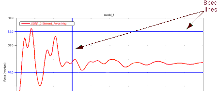
Example of a Spec Line
There are no limits to the number of spec lines you can add to a plot.
Notes: | If you have turned on plot statistics, you can quickly create a spec line at the current location of the plot tracking cursor using the keyboard shortcuts: ■s or S create vertical spec lines. ■h or H create horizontal spec lines. |
To add a spec line to a plot:
1. Select the plot to which you want to add a spec line.
2. From the Plot menu, select Create Spec Line, or click the Create Spec Line icon  in the toolbar.
in the toolbar. 3. In the Spec Line Name text box, enter the name you want to assign to the spec line. The box shows the complete name of the spec line, including its parents in the database.
4. In the Y Value and X Value text boxes, enter:
■For a horizontal spec line, enter only a y value.
■For a vertical spec line, enter only an x value.
■For a diagonal spec line, enter both an x and y values.
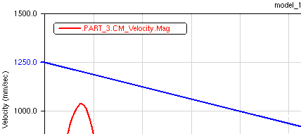
For example, entering both x and y values, provides the following diagonal spec line:
5. Select a color, type of line, and thickness for the line. The thickness values range from 1 to 5 screen pixels.
6. Select OK.
To modify a spec line:
1. Select the line.
2. In the property editor, set values for the line as explained above for creating a spec line.
FFT3D Color Map Plot
You can create a freehand-drawn spec line on a 3D FFT plotting view (2D Color Map).
The following figure shows spec lines that have been added to a 3D FFT color map plot.
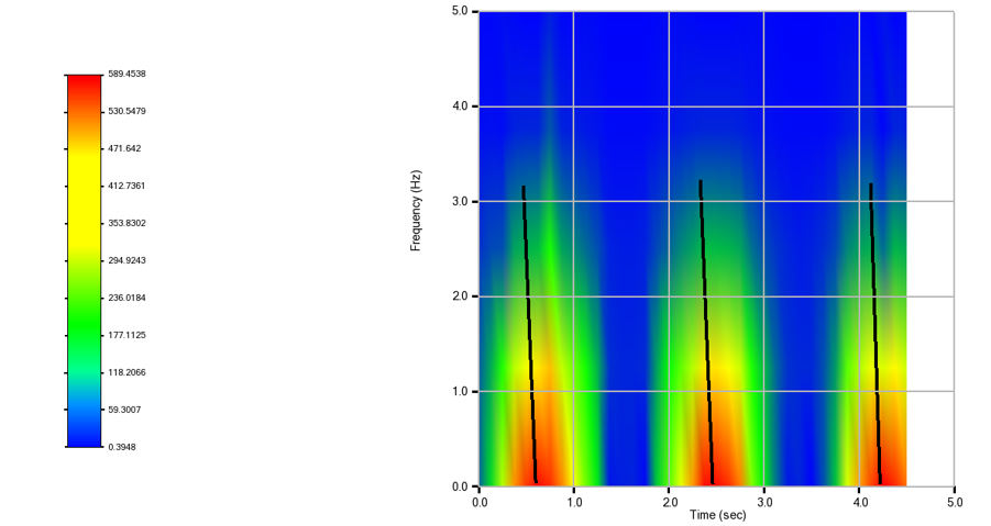
To add a spec line to a 3D FFT color map plot:
1. Select the 3D FFT color map plot to which you want to add a spec line.
2. From the Plot menu, click the Create Spec Line icon 
3. Click on plot to select start and end points for the spec line. This will create spec line object with default properties and current 3D plot as a parent.
To modify a spec line:
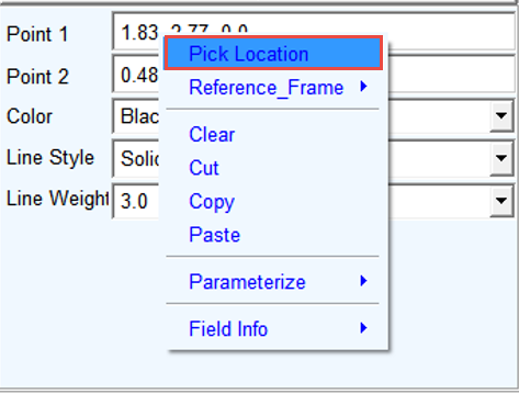
1. Select the line and the property editor current properties will be visible. Point 1 and Point 2 show the start and end point locations
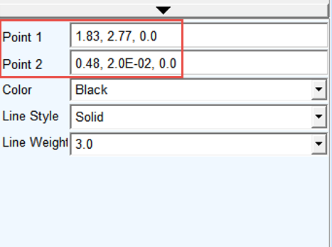
2. To modify these locations right-click in the respective fields, and select Pick Location and then select the desired point on the plot. Alternatively, you can directly enter new location values in the field. Other properties of the spec line can be modified via the option menus below.