Plots Basics
About Curves on Plots
Curves on plots are made up of data points. Each data point represents data that the Adams product created at an output step during a simulation, test data that you've imported, or data from Adams Solver files (Request file or Results file). For results from a simulation, you specify the number of output steps when you perform a simulation, and, thus, you set the number of data points in a curve. For information on setting output steps, refer to the Adams product documentation you used to create the simulation results.
After you created curves, you can perform post-processing operations on curves, such as filter the data through signal processing or mathematical calculations. You can also manually change the values and write expressions that define the values in curves. For more information on post-processing on curves, see Performing Calculations on Curves and Manipulating Curve Data.
Types of Simulation Results You Can Plot
Adams provides you with several different types of results that you can plot. Some of the results you must request and some Adams products generate automatically.
■Objects - Characteristics of objects in your model, such as the position of the center of mass of a part for the x component. They correspond directly to object measures. To view objects, you must run Adams PostProcessor with Adams View or import a Adams View command file (.cmd).
■Measures - Characteristics of quantifiable objects in your model, such as the force applied on a spring-damper or the relationship between objects. You can create measures directly in an Adams product or import test data as measures. To view measures, you must run Adams PostProcessor with Adams View or import a model and a Results file (.res).
Learn:
■Results - A basic set of state variable data that Adams calculates during a simulation. Adams outputs the data at each simulation output step. A component of a result set is usually a time series of a particular quantity (for example, the x displacement of a part or the y torque on a joint).
■Requests - Data that you have requested that Adams Solver output. You can ask for any type of displacement, velocity, acceleration, force or user defined filter information that you want to investigate.
♦If the "Define Using Type and Markers" method is used, the requests appear under the displacement, velocity, acceleration, or force filters.
♦If the "Define Using Function Expression" method is used, the requests appear under the "user defined" filter.
♦If the "Request Name" and "Result Set Name" are exactly the same, the request appears under the Subsystem heading, but if they are different, then the request appears at the top level.
♦If component names and component units are given, but the results name is not specified, then the request will appear in the “Result Sets” list.
■System modes - You can view scatter plots of the eigenvalues from linear simulations.
Clearance studies - You can view the minimum distances between objects in your animation. Learn about Performing Clearance Studies.
For Adams Vibration, you can also plot the following:
■Frequency Response - The magnitude and phase response produced by a given input channel, at a given omega, for a given output channel.
■Transfer Function - Transfer function is a basic property of a model, and is computed as the magnitude and phase response at a given output channel for a given input channel with a unit swept sine vibration actuator.
■PSD - Power spectral density of output channels for given input PSDs.
■Modal Coordinates - Modal coordinates are states in the frequency domain solution associated with a specific mode. Modes most active in a frequency response can be identified from the modal coordinates.
■Modal Participation - The absolute contribution of model modes to the transfer function for the model.
See the Adams View Object Characteristics You Can Plot for more information.
About the Dashboard in Plotting Mode
When you are in plotting mode, the Dashboard lets you select the data that you want to plot. The dashboard in plotting mode is shown below.
Learn more about the Plotting Dashboard.
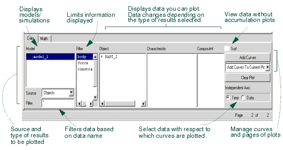
The list on the left side of the Plot Builder contains the simulation results that are available for plotting. These include objects, measures, requests, result sets, and system modes. The list contains the models or results you have loaded and is set to view object characteristics. If you have three different models loaded, the list of models would look like the following:
.model_1
.model_2
.model_3
If you are viewing requests, measures, or results, the list contains the names of all the simulations you've imported into Adams PostProcessor. For example, if you have three different models and two simulations on model_3, then the list looks like the following:
.model_1.Last_Run
.model_2.Last_Run
.model_3.Last_Run
.model_3.Run_001
Because you see all the simulation results at once, it is easy for you to plot results between simulation runs and even between simulations from separate models (for example, plot body acceleration from one model against another model).
Plotting Objects
You can plot characteristics of objects in your model. You do not need to create object measures to plot object characteristics. You can select to display more than one object characteristic at a time.
To plot objects, you must run Adams PostProcessor with Adams View or import model and results.
To create a plot of object data:
The dashboard changes to show the results available for plotting.
2. Select a model whose object characteristics you want to plot.
3. From the Object list, select the object whose characteristics you want to plot. The Object list contains a list of all the objects in your model that are of the type specified in the Filter list. Learn about Filtering Lists of Data to be Plotted.
4. From the Characteristic list, select the characteristic of the selected object that you want to plot.
5. From the Component list, select one or more components of the characteristic that you want to plot.
6. Select Add Curves to add the data curve to the current plot.
Plotting Measures
To create a plot of measure data:
The dashboard changes to show the measures available for plotting.
2. From the Simulation list, select a simulation. The list contains all the potential sources of data for creation of plots. As you add additional simulation results, these appear in the Simulation list.
3. Select the measure or measures that you want to plot. Learn about Selecting and Deselecting Objects in Adams Postprocessor.
4. Select Add Curves to add the data curve to the current page.
Plotting Requests and Result Sets
Adams PostProcessor supports both plotting of Request file (.req) and Result set component (.res).
To create a plot of a result or request component:
■Requests - Plot request components.
■Result Sets - Plot any result components from a simulation.
The dashboard changes to show the results available for plotting.
2. From the Simulation list, select a simulation. The list contains all the potential sources of data for creation of plots. Any new simulations that you add, appear in the Simulation list.
3. From the Result Set or Request list, select a result or request.
4. From the Component list, select components to plot. Learn about Selecting and Deselecting Objects in Adams Postprocessor.
5. Select Add Curves to add the data curve to the current plot.
Note: | In some cases when requests are present in a model there will be an additional analysis listed in the plotting dashboard named "REQSAVE_COMPATIBILITY". See "About the "REQSAVE_COMPATIBILITY" analysis" for details. |
Plotting System Modes
You can create a scatter plot of eigenvalues from a Linear simulation. You plot the real eigenvalues against the imaginary eigenvalues. In addition, you can plot the eigenvalues with a table of eigenvalues. See Picture of Plotting System Modes.
Learn about setting the color and symbols of the scatter plot with Property Editor - Scatter dialog box help.
To plot a scatter plot of eigenvalues:
2. From the Eigen list, select a set of eigenvalues.
3. Select Add Curves to add the scatters to the current plot.
To plot a scatter plot with an eigen table:
1. From the dashboard, set Source to System Modes.
2. From the Plot menu, select Create Scatter Plot with Eigen Table.
3. If you have more than one one eigen in the database, select the eigen of interest.
The scatter plot appears.
Note: | If you're plotting Adams Vibration data, you can also create the plot by selecting Vibration -> Review -> Create Scatter Plot with Eigen Table. |
Viewing Test Data
You can easily import test data by reading in an ACSII file using the Import command on the File menu. Learn about importing test data.
Adams PostProcessor imports test data from a column-based file and stores the data as Measures. Once Adams PostProcessor has imported the test data as a measure, you can plot, display, or modify it as you would with any other measure. Learn about plotting measures.
Quickly Reviewing the Results of Simulations
You can quickly scan the results of your simulation without having to create a large number of plot pages. This is called surfing.
To surf results:
2. Select the simulation results you want to plot.
Adams PostProcessor automatically clears the current plot and displays the simulation results after you make each selection.
3. Continue selecting simulation results to plot.
Adding Curves to Plots
You can add as many curves as you'd like to a plot. You can also choose to create a new plot each time you add a curve or create a different plot for each object, request, or result you select to plot. For example, Adams PostProcessor lets you automatically plot the velocity, acceleration, and placement of a single object on a plot. When you plot data about a different object, you can set Adams PostProcessor to automatically create a new plot for the data.
If you choose to add curves to the currently selected plot, Adams PostProcessor assigns each new curve a different color and line style so you can differentiate the curves from one another. For example, the first curve you create is red, the next blue, and the third magenta. You can change the automatic assignment of properties to a single color, style, and symbol that you define. Learn about setting curve properties.
Adams PostProcessor creates a dependent (vertical) axis for each unit type. For example, if you plot displacement and velocity on the same plot, then Adams PostProcessor automatically displays two dependent axes (one for displacement and one for velocity).
To add curves:
1. Select the results to plot.
2. From the pull-down menu located below the Add Curves button on the Dashboard, select how you'd like Adams PostProcessor to add the curves. You can select:
■Add Curves to Current Plot - Adds the curve to the currently selected plot.
■One Curve Per Plot - Creates a new plot on a new page for the curve.
■One Plot Per Object, Request, or Result - Creates a new plot for the curves containing data about a particular object, request, or result. (Not available for measures.)
3. Select Add Curves.
Using an Independent Axis Other Than Time
The default data used for the independent axis of a plot is simulation time. You can use other data than simulation time.
Note: | The independent axis, by default, is along the x-axis. To change its position, see Setting Up Plot Parameters. |
To select data other than time:
1. From the right side of the dashboard in the Independent Axis area, select Data.
The Independent Axis Browser appears.
2. Select the desired data, and then select OK.
Filtering Lists of Data to be Plotted
The Filter list in the dashboard lets you select a subset of all the possible data to be displayed. This is convenient for large models where the object list could be very long and difficult to read. In addition, you can filter lists of data based on their name. For example, you can specify that Adams PostProcessor only display objects that start with PART_.
To filter the data to be displayed:
■From the Filter list, select the type of data that you want to display. The objects available to display depend on the type of results you selected.
For information on selecting more than one object in the Plot Builder, see Selecting Objects in Adams PostProcessor.
To filter on the name of data:
■Below Source, in the Filter text box, enter the name of the data that you want to display. Type any wildcards that you want included. For more on wildcards, see Using Wildcards.
Updating Plot Data
If you are iteratively changing your model and reviewing results, you will find that the Replace Simulations command saves you lots of time. You can update the data in the plots with that stored in simulation result files, without recreating the plots. You can also add data from other simulations to your existing plots.
When you update your plots, Adams PostProcessor looks for simulation results in the original simulation Results file (for example, a Request file) from which you imported the current data. If the time and date stamp on the original file is more recent than the time and date stamp on the plot, Adams PostProcessor reloads the plot with the updated data.
If you use the Add Simulation option, a new legend, called the simulation legend, appears on the left side of the plot. The simulation legend identifies the source of the data grouped by color or line style. The original legend, called the curve legend, continues to show information about the original curves.
To update your plot data:
1. On the File menu, select Replace Simulations.
Tip: | From the Main toobar, select  . . |
The Add/Replace Simulations dialog box appears.
2. In the upper left corner of the dialog box, select either of the following option buttons:
■Add Simulation to add new curves.
■Replace Simulation to update the curves already on the plot.
3. In the Runs text boxes, enter the name of the simulation containing the simulation results to be replaced. By default, the results of the last simulation (Last_run) replaces any simulation results that the curves use.
4. Set the color, line style, and weight for the new or existing (old) curves. If you select No Change, Adams PostProcessor uses the current color of the curve representing the data to be added or replaced. Select Auto to allow Adams PostProcessor to automatically assign colors to the curves.
5. In the Update Pages area, select the pages containing the plots that you want to update.
6. Select OK.
Clearing Plot Data
You can quickly remove all curves on the current plot.
To clear plot data:
■On the right side of the dashboard, select Clear Plot.
Displaying Plot Statistics About Curves
You can display statistics about curves, including:
■Coordinates of individual data points.
■Minimum, maximum, and average values of visible data points.
■Average slope of the curve at individual data points.
■Root mean square (RMS) calculation of dependent values over the entire curve.
■Number of points of the curve used in statistics computations.
You can also find the distance between two data points and the magnitude of the cursor excursion.
Adams PostProcessor displays plot statistics either using the numeric format of the curve's axis or the numeric format of the table column (if the plot is displayed as a table). The curve format takes precedence if it is set.
Note: | Adams PostProcessor uses only the portion of the curve between the horizontal axis limits when it performs the minimum, maximum, average, and RMS calculations, as well as when it determines the number of points used in a calculation. To inspect statistics on a subset of the curve, zoom in on a subset of the curve. |
When you choose to display statistics, Adams PostProcessor displays a Statistics toolbar as shown below.
Statistics Toolbar

To toggle on and off the display of the Statistics toolbar:
■On the View menu, point to Toolbars, and then select the Statistics Toolbar.
Tip: | On the Main toobar, select  . . |
The Statistics toolbar appears at the top of the window below any toolbars that you've already displayed. A vertical line appears at the currently selected data point.
To display statistics about different data points on a curve:
■Select a different data point. To select a data point, you can either:
■Use the left and right arrow keys to move from data point to data point along a curve.
■Use the mouse to move the cursor to another data point.
■Use the up and down arrow keys to move between curves.
To display the local maximum data points:
■Hold down the Shift key and use the left and right arrow keys to move from one local maximum data point to another.
To display the local minimum data points:
■Hold down the Ctrl key and use the left and right arrow keys to move from one local minimum data point to another.
To determine the distance between two data points:
1. Select the first data point and press and hold down the left mouse button.
2. Drag the cursor to the next data point.
Adams PostProcessor displays the distance between the two data points in the Statistics tool bar. It places a D in front of the coordinate values. Adams PostProcessor also displays a MAG text box, which displays the magnitude of the cursor displacement. The magnitude is the square root of the sum of the squares of the two coordinate values.
3. Drag the cursor to another data point or release the mouse button.
Notes: | If you have turned on plot statistics, you can quickly create a spec line at the current location of the plot tracking cursor using the keyboard shortcuts: ■s or S create vertical speclines. ■h or H create horizontal spec lines. |
Listing of Plot Parameters
The parameters you can set for an entire plot are listed below:
■Title and subtitle - Lines of text that describe the plot.
Note: | For information on setting Adams PostProcessor so it automatically displays titles, see PPT Preferences - Plot. For information on modifying the appearance of the text in the titles, see Adding Notes and Modifying Text. |
■Analysis name and date - Automatically display the name of the analysis from which the plot data was generated, and the date on which the analysis was run.
■Legend text - There are two types of legends on a plot:
■Curve legend - Text that describes the data that each curve on the plot represents. Adams PostProcessor displays the legend with a short line segment illustrating the color and line style of the curve.
■Simulation legend - If you add simulation data as explained in Updating Plot Data, Adams PostProcessor creates a second legend, called the simulation legend.
Note: | For information on modifying the appearance of the text in the legends, see Modifying Legend Properties. |
■Dependent axis - Set the orientation (vertical or horizontal) of the dependent axis. Note that you can only change the orientation if there are no curves on the plot.
■Grid - A collection of horizontal and vertical lines that serve as visual guides for inspecting curves. You can have primary and secondary grid lines. Primary grid lines appear at all major unit sections. Secondary grid lines appear at specified intervals between the primary grid lines. If you turn off the primary grid lines, Adams PostProcessor also turns off the secondary grid lines.
■Borders and plot placement - The ruling lines around the plot and the margins (white space) that appear on the left and bottom of the screen surrounding the plot.
Note: | Adams PostProcessor automatically sizes a plot to fit in the viewport. The axis limits, notes, and axis values do not change but the aspect ratio of the plot border changes based on the aspect ratio of the viewport. |